
Siddharth Chhatpar
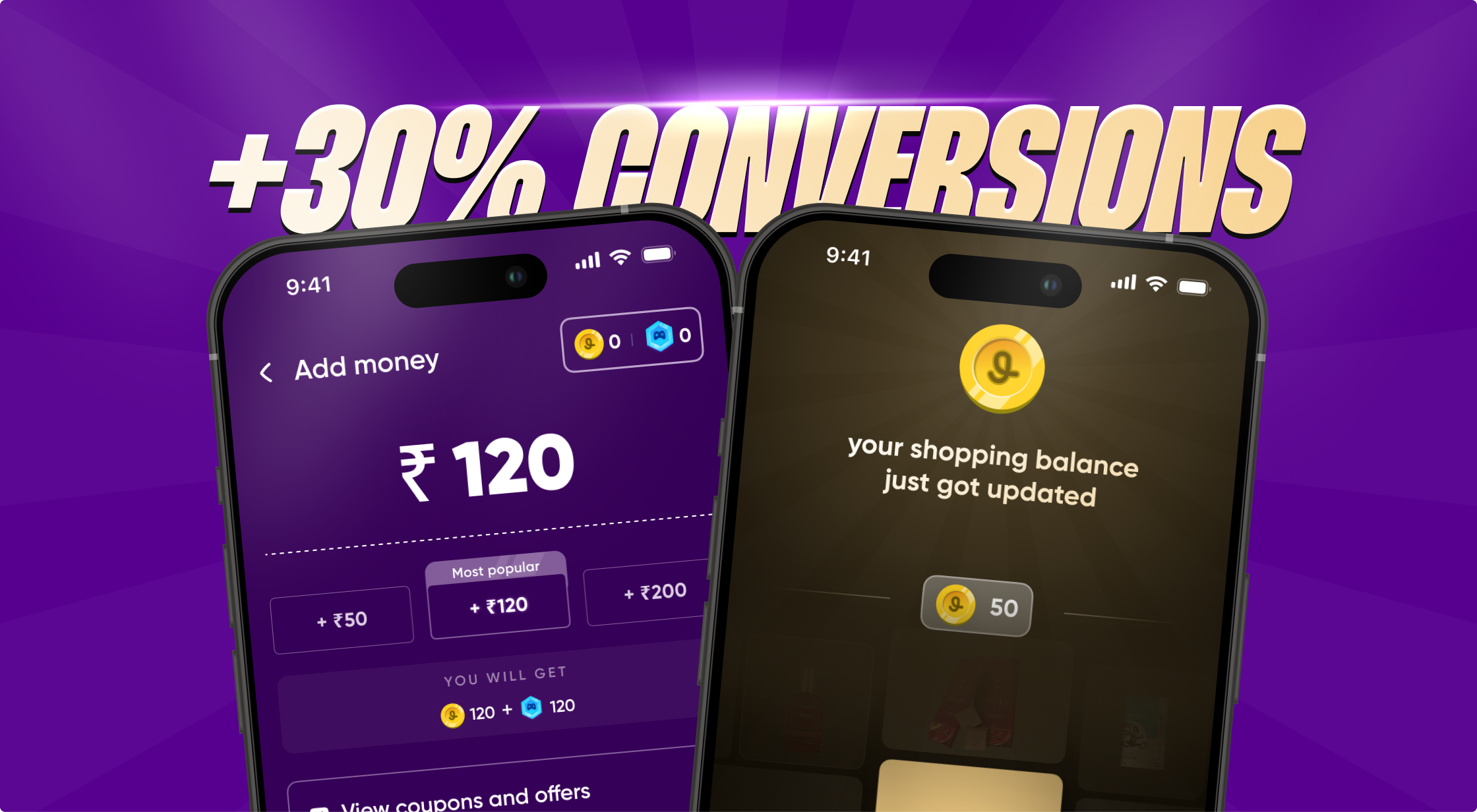
Boosted top-up conversion rates for a gaming platform with 2M+ users.
role
Product Design
duration
2 weeks
team members
2 designers
introduction
Jumbo is a real-money gaming platform built around a simple but powerful idea: you shouldn’t feel scared to play. With its “No Money Loss” model, users add money to their wallet, get free Gems to play games like Ludo, and either win real cash or use their balance to shop from well-known brands.
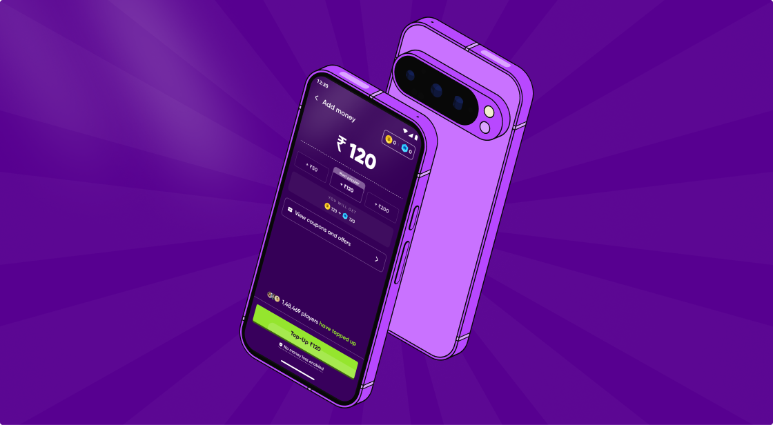
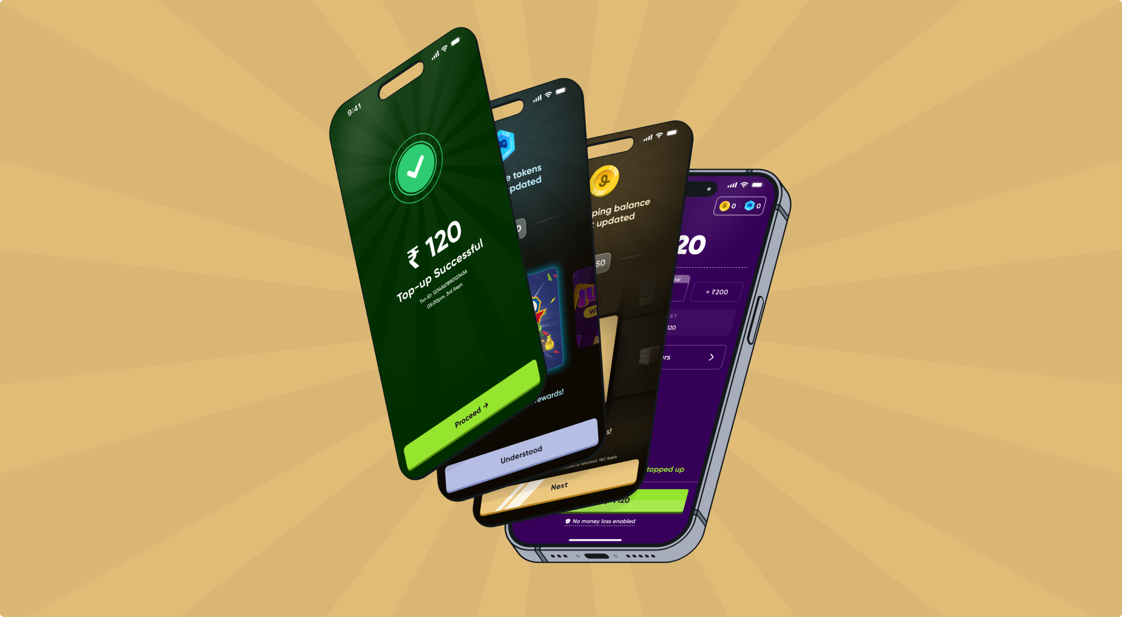
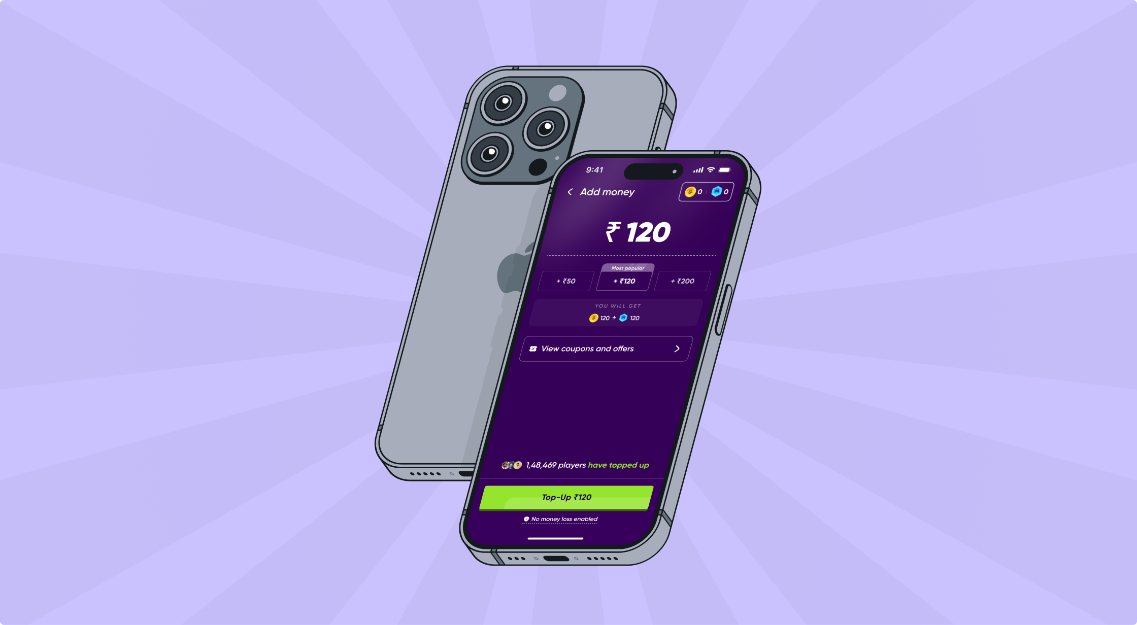
I worked on redesigning Jumbo’s top-up experience; the moment where users decide whether they trust the product enough to add money. This wasn’t just a UI problem. It was a trust problem, a clarity problem, and a confidence problem.
problem statement
When users reached the top-up flow, a few things were happening:
People didn’t fully understand how the “No Money Loss” system worked
Adding money felt risky instead of reassuring
The experience felt more like a payment screen than a product moment
STRATEGIC SPRINT
Fixing the real drop-off: friction, not features.
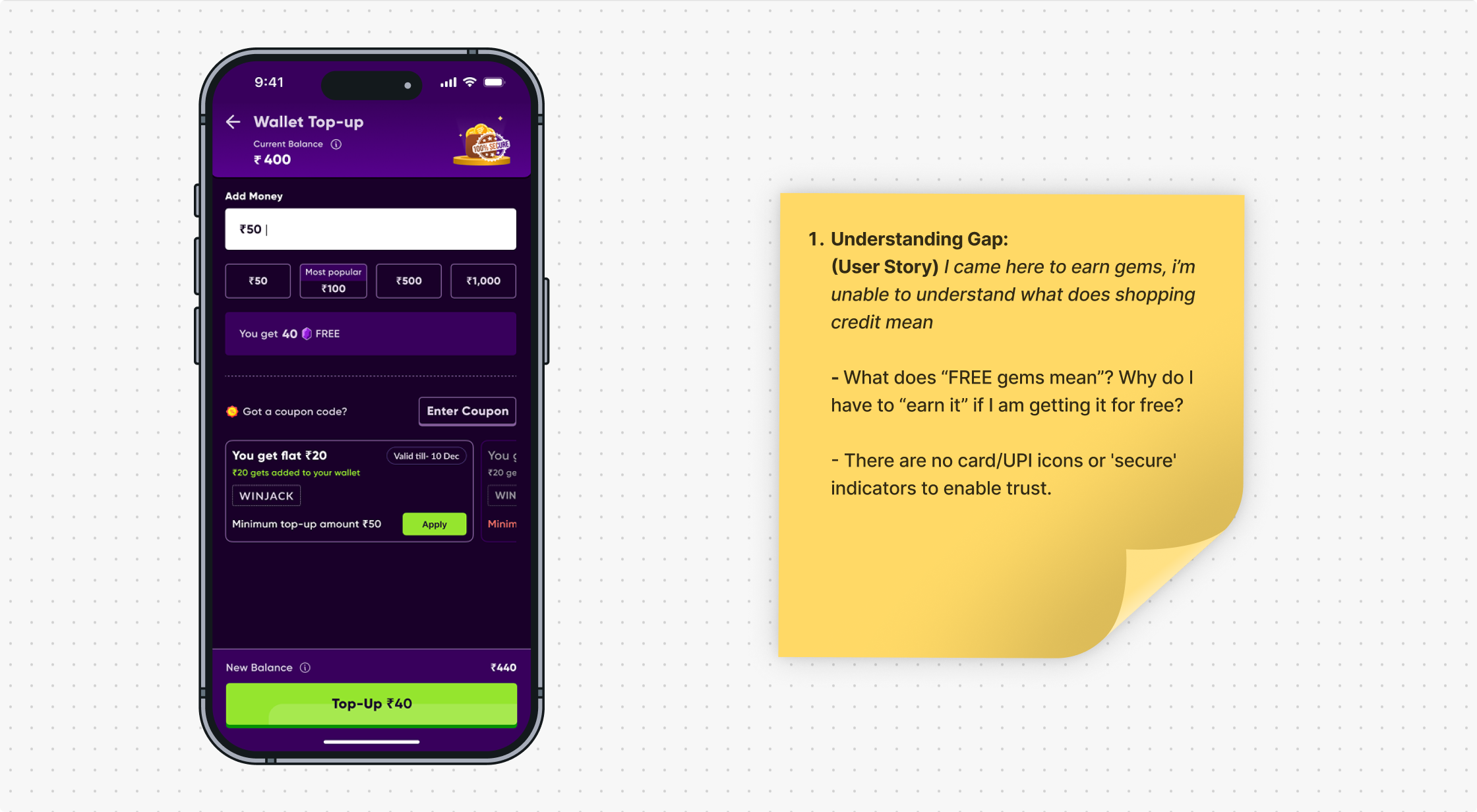
Conducted an audit to identify the potential drop-off points
Came up with user stories to help us define our ideal consumer persona
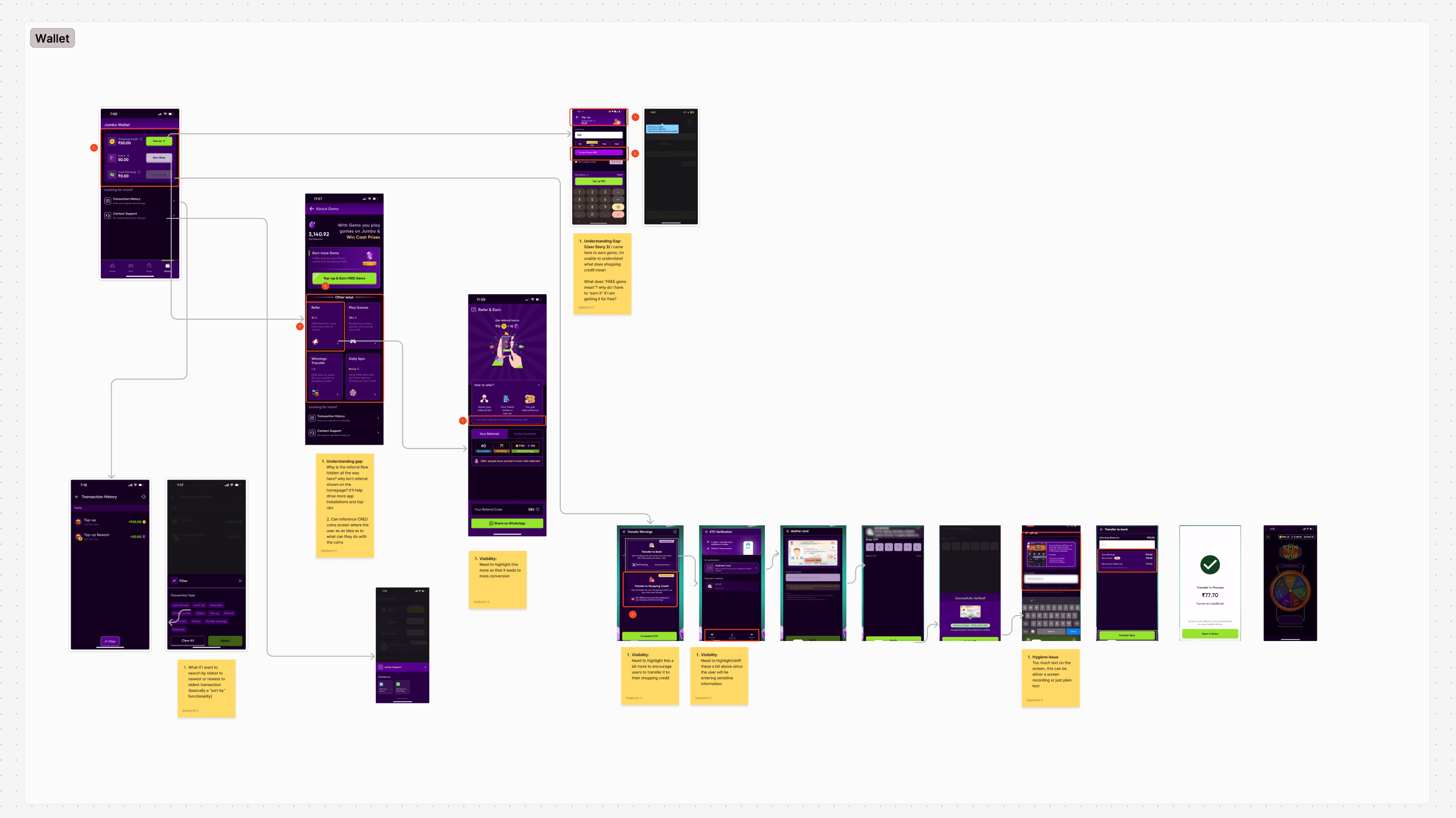
Mapped out the entire journey
brainstorming
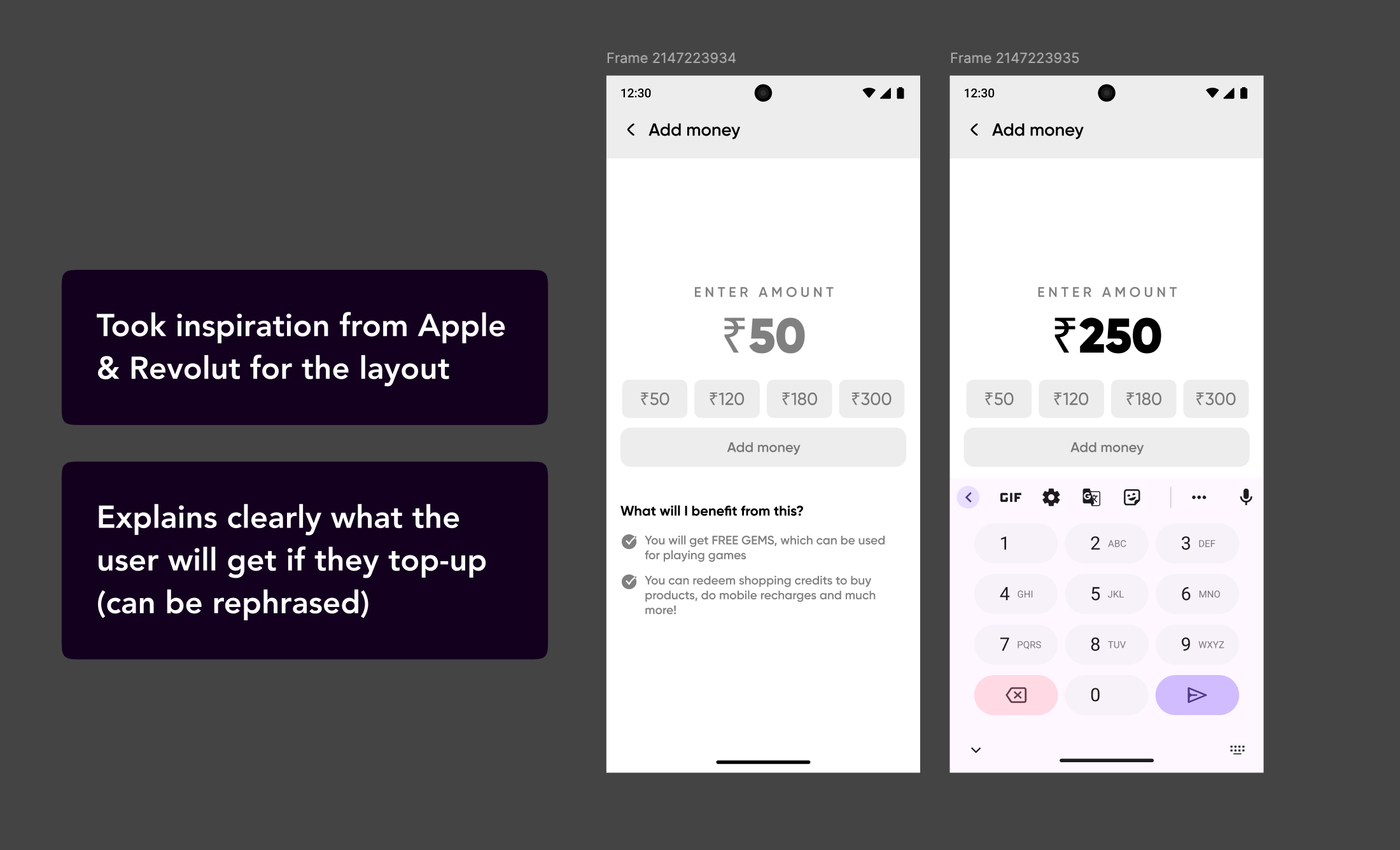
Direction 1: Explain First
Takeaway
People understood the system better, but the flow felt slow and heavy.
Direction 2: Adding Social Proof
Takeaway
Increase in visual density, but stronger trust signals
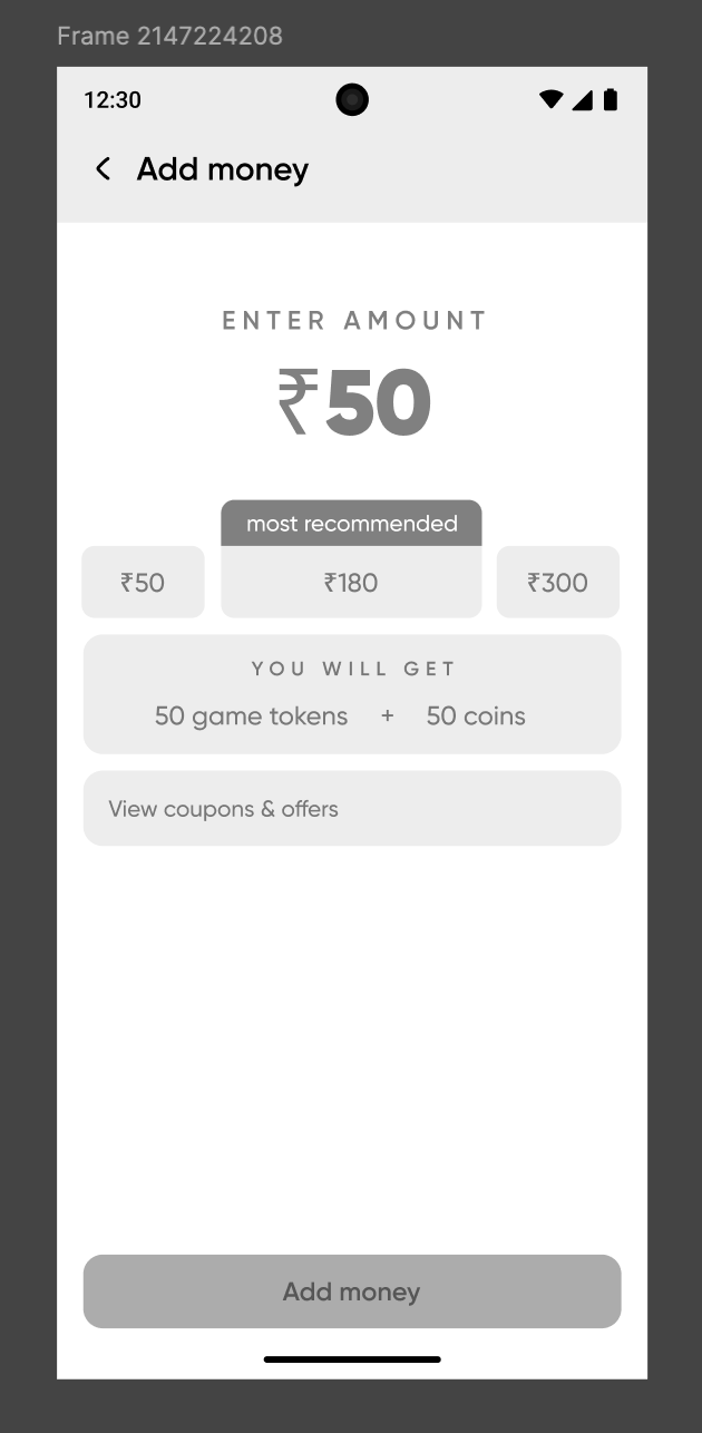
Direction 3: The Chosen One
why it shipped
People felt safe, but not slowed down.
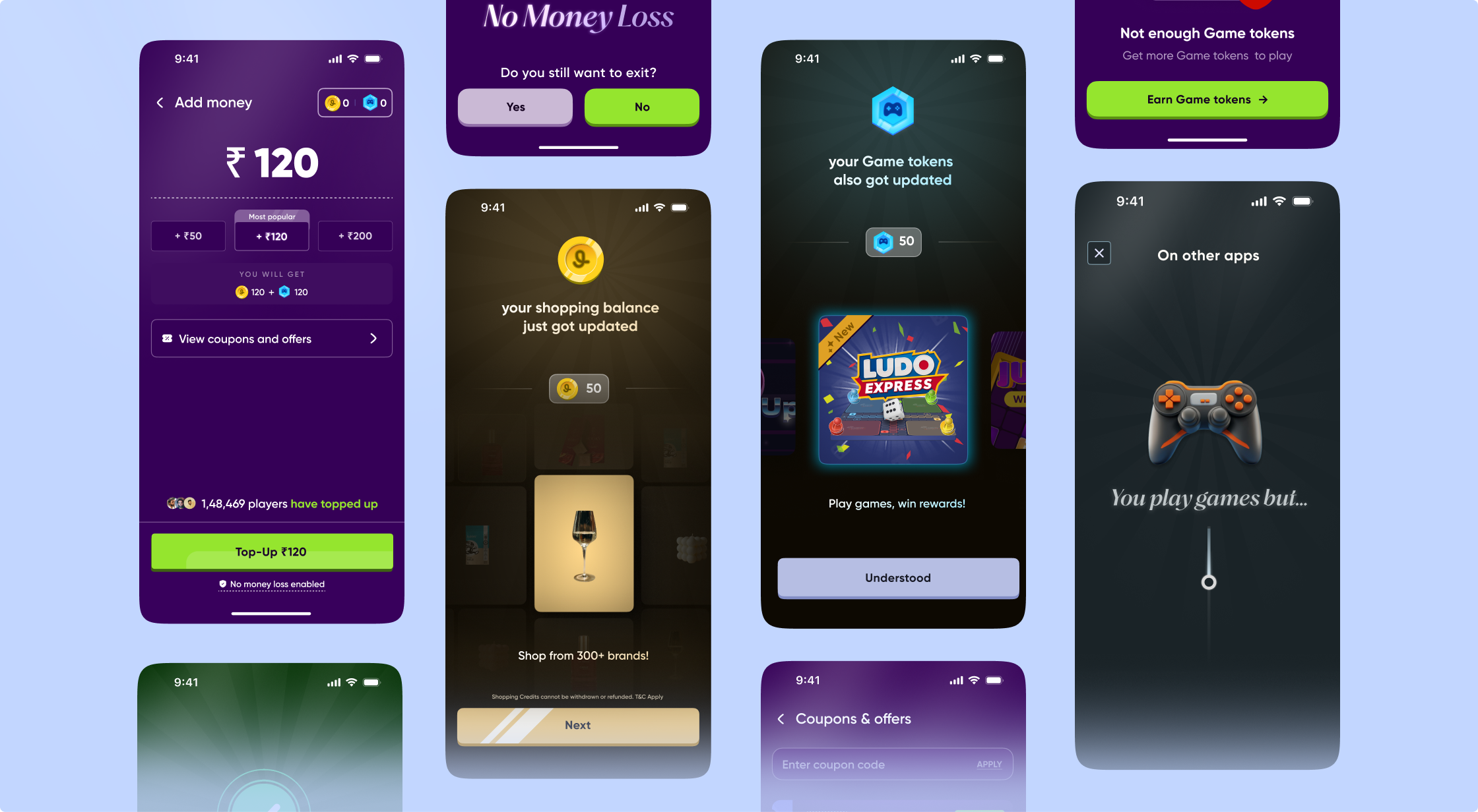
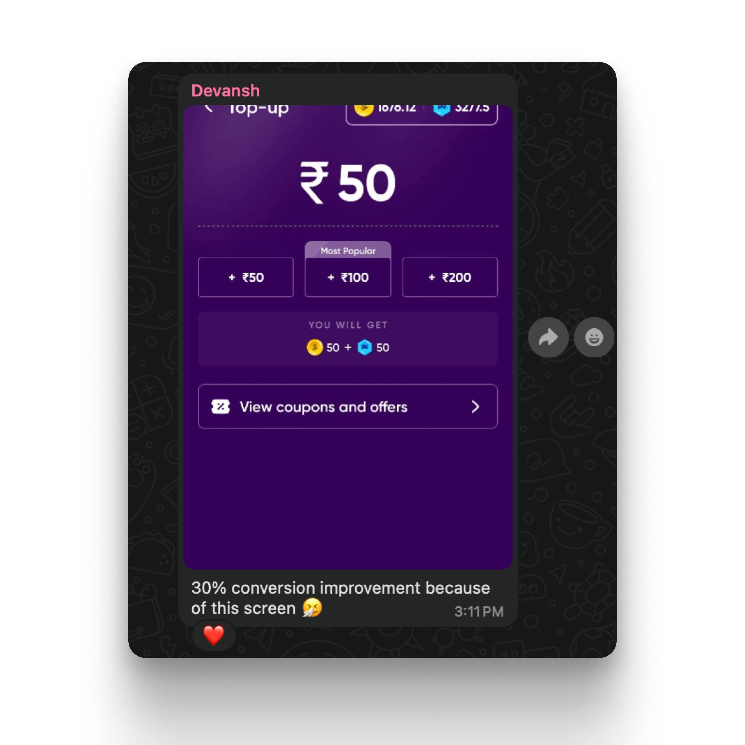
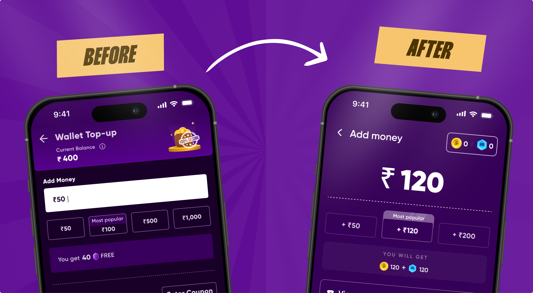
END RESULTS SNAPSHOTS
Every pixel rebuilt for clarity, speed, and action.
Reflection
This project taught me that good design isn’t just about making things look better; it’s about making people feel safer, clearer, and more confident.
We didn’t just redesign a flow. We changed the emotion of a decision.
Siddharth Chhatpar
Boosted top-up conversion rates for a gaming platform with 2M+ users.
role
Product Design
duration
2 weeks
team members
2 designers
introduction
Jumbo is a real-money gaming platform built around a simple but powerful idea: you shouldn’t feel scared to play. With its “No Money Loss” model, users add money to their wallet, get free Gems to play games like Ludo, and either win real cash or use their balance to shop from well-known brands.
I worked on redesigning Jumbo’s top-up experience; the moment where users decide whether they trust the product enough to add money. This wasn’t just a UI problem. It was a trust problem, a clarity problem, and a confidence problem.
problem statement
When users reached the top-up flow, a few things were happening:
People didn’t fully understand how the “No Money Loss” system worked
Adding money felt risky instead of reassuring
The experience felt more like a payment screen than a product moment
STRATEGIC SPRINT
Fixing the real drop-off: friction, not features.
Conducted an audit to identify the potential drop-off points
Came up with user stories to help us define our ideal consumer persona
Mapped out the entire journey
brainstorming
Direction 1: Explain First
Takeaway
People understood the system better, but the flow felt slow and heavy.
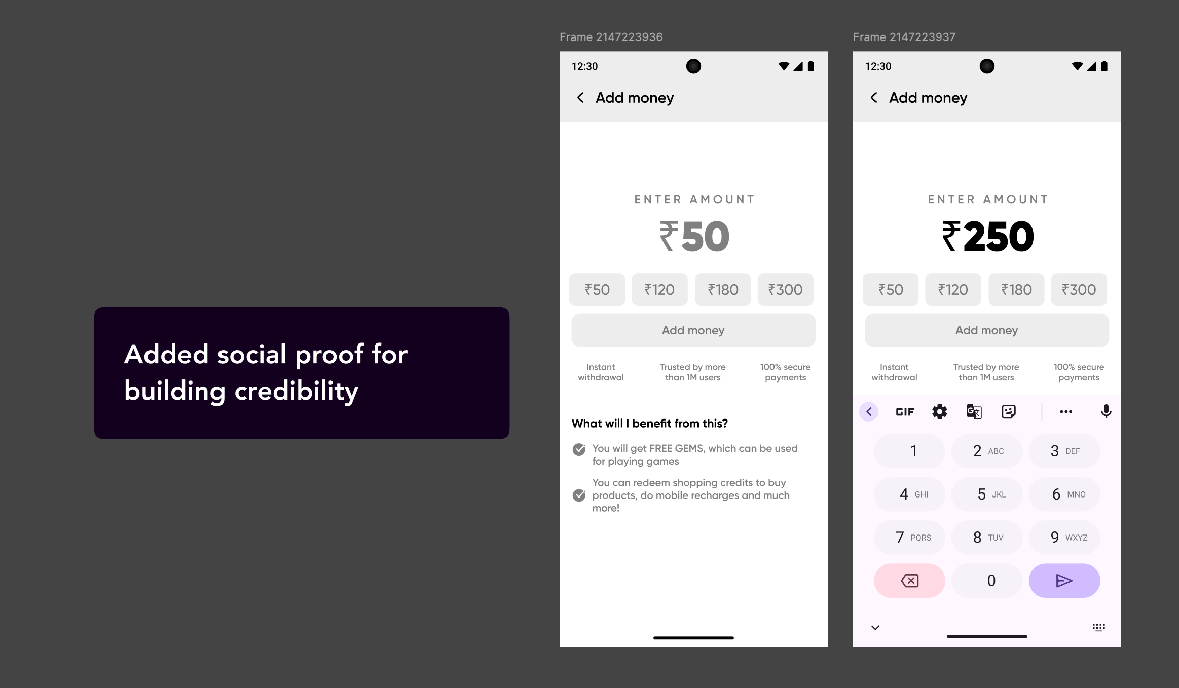
Direction 2: Adding Social Proof
Takeaway
Increase in visual density, but stronger trust signals
Direction 3: The Chosen One
Why it shipped
People felt safe, but not slowed down.
END RESULTS SNAPSHOTS
Every pixel rebuilt for clarity, speed, and action.
reflection
This project taught me that good design isn’t just about making things look better; it’s about making people feel safer, clearer, and more confident.
We didn’t just redesign a flow. We changed the emotion of a decision.
Siddharth Chhatpar
How I boosted top-up conversion rates for Jumbo with 2M+ users.
role
Product Design
duration
2 weeks
team members
2 designers
introduction
Jumbo is a real-money gaming platform built around a simple but powerful idea: you shouldn’t feel scared to play. With its “No Money Loss” model, users add money to their wallet, get free Gems to play games like Ludo, and either win real cash or use their balance to shop from well-known brands.
I worked on redesigning Jumbo’s top-up experience; the moment where users decide whether they trust the product enough to add money. This wasn’t just a UI problem. It was a trust problem, a clarity problem, and a confidence problem.
problem statement
When users reached the top-up flow, a few things were happening:
People didn’t fully understand how the “No Money Loss” system worked
Adding money felt risky instead of reassuring
The experience felt more like a payment screen than a product moment
STRATEGIC SPRINT
Fixing the real drop-off: friction, not features.
Conducted an audit to identify the potential drop-off points
Came up with user stories to help us define our ideal consumer persona
Mapped out the entire journey
brainstorming
Direction 1: Explain First
Takeaway
People understood the system better, but the flow felt slow and heavy.
Direction 2: Adding Social Proof
Takeaway
Increase in visual density, but stronger trust signals
Direction 3: The Chosen One
Why it shipped
People felt safe, but not slowed down.
END RESULTS SNAPSHOTS
Every pixel rebuilt for clarity, speed, and action.
reflection
This project taught me that good design isn’t just about making things look better; it’s about making people feel safer, clearer, and more confident.
We didn’t just redesign a flow. We changed the emotion of a decision.